How to Style a Bookcase: A Step-by-Step Guide for Balanced Shelves
Most bookcases fall into one of two traps. Either they hold nothing but books, packed shoulder to shoulder in whatever order they came off the shelf, or they hold everything — paperbacks, a tangle of cables, three birthday cards and a dusty candle — with no relationship between any of it. Neither is a disaster. Neither looks styled, either. The difference rarely comes down to what you own; it comes down to four decisions: colour, height, texture and the space you deliberately leave empty.
What follows is a method you can work through in an afternoon, one shelf at a time. It assumes a standard bookcase of five or six shelves, but the same thinking scales down to a single wall shelf or up to a full alcove unit.
Start by emptying, not arranging
Take everything off, one unit at a time, and dust the shelves properly while they are bare. Then sort the contents into three piles: display, store elsewhere, and out. That third pile is usually bigger than people expect, and it is the one that makes the rest look calm.
Next, decide what job the unit is doing. A shelf that is roughly 70 per cent books reads as a library that happens to be styled. A shelf that is closer to 50/50 reads as a display unit with books in it. Both work; mixing the two by accident does not. If the bookcase faces a sofa or a bed, treat the eye-level shelf as the star and keep the rest quieter. If it sits beside a doorway, resist crowding the lower shelves, where you will walk past them a dozen times a day.
Choose a colour story, then repeat it
Pick an anchor colour that already exists in the room — the navy of a cushion, the rust in a rug, the deep green of a lamp base. Add one accent and let the rest fall back on neutrals: cream, black, natural wood, undyed linen. You are not redecorating, just echoing.
Repetition is what makes it look deliberate. A colour used once looks like a mistake; the same colour used three times across six shelves looks intentional. Spread those hits out rather than clustering them, and reserve the strongest one for the middle band, where the eye naturally lands.
Books are the easiest colour blocks you have. If spine colours are a jumble, group by tone: a run of pale spines, then a run of dark ones, then a small stack laid flat. Turning a few covers face-out breaks up the wall of spines, but only do this where the cover is genuinely handsome and the edges are clean. Alphabetising is optional and, in a living room, mostly unnecessary.
Vary height and build a rhythm
Flat, even rows are restful for a library and dull for a display shelf. What you want instead is an alternating pattern: something tall, then a low cluster, then a medium object. Odd numbers group better than even ones — three objects, five books — and a trio arranged tall, medium, short forms an easy triangle that the eye reads without effort.
Mix verticals with horizontals. Upright books held by a bookend, then a stack of two or three large hardbacks with a small bowl or dish sitting on top of them. Occasionally line up the tops of a group rather than the bottoms to create a neat horizontal line, and let the varying book heights beneath do the filtering.
One tall item per shelf is plenty. If a vase and a lamp and a framed print all compete for the same shelf, none of them wins.
Add texture so it does not look flat
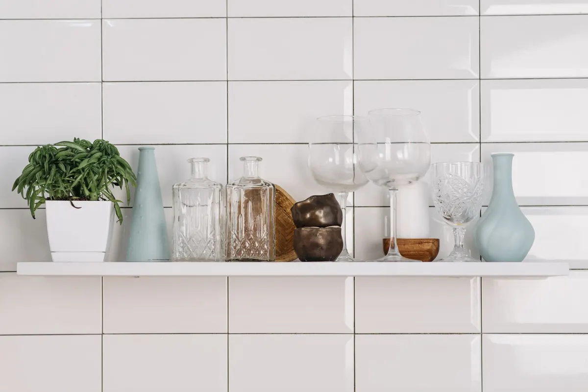
Books are paper, and paper is matte. Once you have a run of it, the shelf needs contrast — something shiny, something rough, something soft. Glazed ceramic next to woven seagrass. A brass candlestick against linen-covered books. Glass and stone, wool and metal. Without this, even a well-arranged shelf photographs as a beige block.
- Shine: a glazed pot, a glass jar, a brass or pewter object.
- Rough: a woven basket, a chunky wool throw folded into a shelf, a stoneware dish.
- Living: a trailing plant to soften a hard edge, or a small fern. Put it where the light actually falls; in a dark shelf a dried stem or a woven piece will look better and last longer.
- Personal: one or two objects with a story — a pebble from a beach, a badly glazed mug made by someone you love.
Leave negative space, roughly a third of each shelf
Empty space is a styling tool, not a failure to fill. Aim to leave about a third of each shelf clear, and more on a dark unit or where the objects are large and heavy. Stop items 5cm or so in from each end so the shelf itself reads as a frame. Leave a clear gap above your objects, too — if a vase touches the underside of the shelf above, it looks crammed rather than placed.
Grouping and gaps work together. Cluster three to five items closely, leave 10cm or so of bare shelf, then start another cluster. Those gaps are what make the groups look chosen.
If in doubt, take one thing off each shelf. Almost nothing gets worse.
The order to work in
Styling in the wrong sequence is how shelves end up overstuffed and top-heavy. Try this instead:
- Style the middle two shelves first. This is the eye-level band and it does most of the work.
- Place the largest objects. One anchor per shelf: a lamp, a big vase, a framed print.
- Add books in blocks of three to five, upright with a bookend or stacked flat with something resting on top.
- Slot in the small pieces last — a small dish, a candle, a photograph. Slightly off-centre almost always beats dead centre.
- Layer where you can. A stack of two books, a dish on top, a small object on the dish.
- Step back two metres and squint. If everything carries the same visual weight, remove something. Then photograph the shelf — flaws show up on a screen faster than in person.
- Do the top and bottom shelves last, and most sparingly. Top: something light and fairly tall. Bottom: baskets or boxes for the things you want out of sight.
Keeping it looking good
Live with the arrangement for a week before you change anything. If one object keeps pulling your eye for the wrong reason, move it rather than adding something new. Each season, swap two or three items between rooms — a vase for a candle, a framed picture for a bowl — which refreshes the unit for nothing. Fewer objects also means faster dusting, and a dry microfibre cloth is all you need.
Give the unit a job. In a busy room, a purely decorative shelf becomes a dumping ground within a fortnight, so include a tray or a shallow basket for keys, post and headphones. And leave one sign of use: a book at a slight angle, a bookmark, a mug on the shelf below. Shelves that look untouched read as a showroom rather than a home.
Finally, if your bookcase is tall or freestanding, secure it to the wall using the fixings supplied and the correct anchors for your wall type — tipping bookcases are a genuine risk, particularly in homes with young children. Style it well, then make sure it stays put.
Photo: garten-gg / Pixabay